Box Of 6ix
– An Entrepreneurial Endeavor
Problem - Local businesses are struggling through the pandemic
Covid19 has done a lot of damage to our local economy. Seeing our diverse Toronto businesses closing down has been heartbreaking, especially remembering the amazing people behind them. It’s important that we do what we can to help them survive through lockdowns. This design intends to provide relief to the local businesses affected.
How might we encourage our community to consistently support local businesses?
Having a well rounded understanding of circumstances is the key to proper design. In order to reach this level of understanding for the Box of 6ix project, we performed research on the following:
Potential Clients to understand how to properly assist them in their needs.
A Competetive Analysis to determine what worked and what didn’t for other companies with similar products on the market. More importantly - Why.
Customers and Users to find the best marketing channels and what products were desired by our target demographic.
Toronto’s Diverse Neighbourhoods to understand the affinity people had for their respective environments.
Toronto’s Local Products to gain insight into feasibility and desirability.
Clients
To better understand our clients, we conducted informal field interviews. We met with several small business owners in different communities to discuss the impact the pandemic had on their business what they have tried to help themselves, what help they needed from others, and their overall frustrations caused by the pandemic.
The insights obtained were the following:
Competitive Analysis
In order to determine successes and failures of competitors, we immersed ourselves in the subscription box world.
We conducted secondary research by finding a list of the 30 best selling subscription boxes across different genres and interests. From there we categorized them by themes, ratings/reviews, price, frequency model, sales platforms, marketing platforms, and unique features.
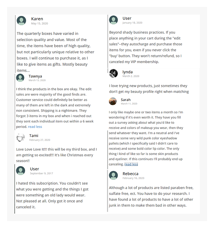
Next we combed through the customer reviews of the top 5 best selling monthly subscription boxes, categorizing the qualitative data based on the key topics that were often discussed helped uncover the pains and gains in the industry.
We participated in primary research methods and ordered subscription boxes. Going through the “About”, “Surveys” and “Checkout” pages revealed a disconnect in the experience of receiving the subscriptions and the promise made by the brand. The two experiences needed to be more cohesive and brand promises were not properly met.
We identified common positives like customizations and pain points such as repetitiveness and poor customer service response times.
Insights emerged as we dug in that women are the most likely to purchase a subscription box for themselves or as a gift. Solid branding is also the key to a successful subscription box.
The most successful subscription boxes offered a balance between products that were kept, consumed and informational. Often information is just as valuable as a product.
Customers and Users
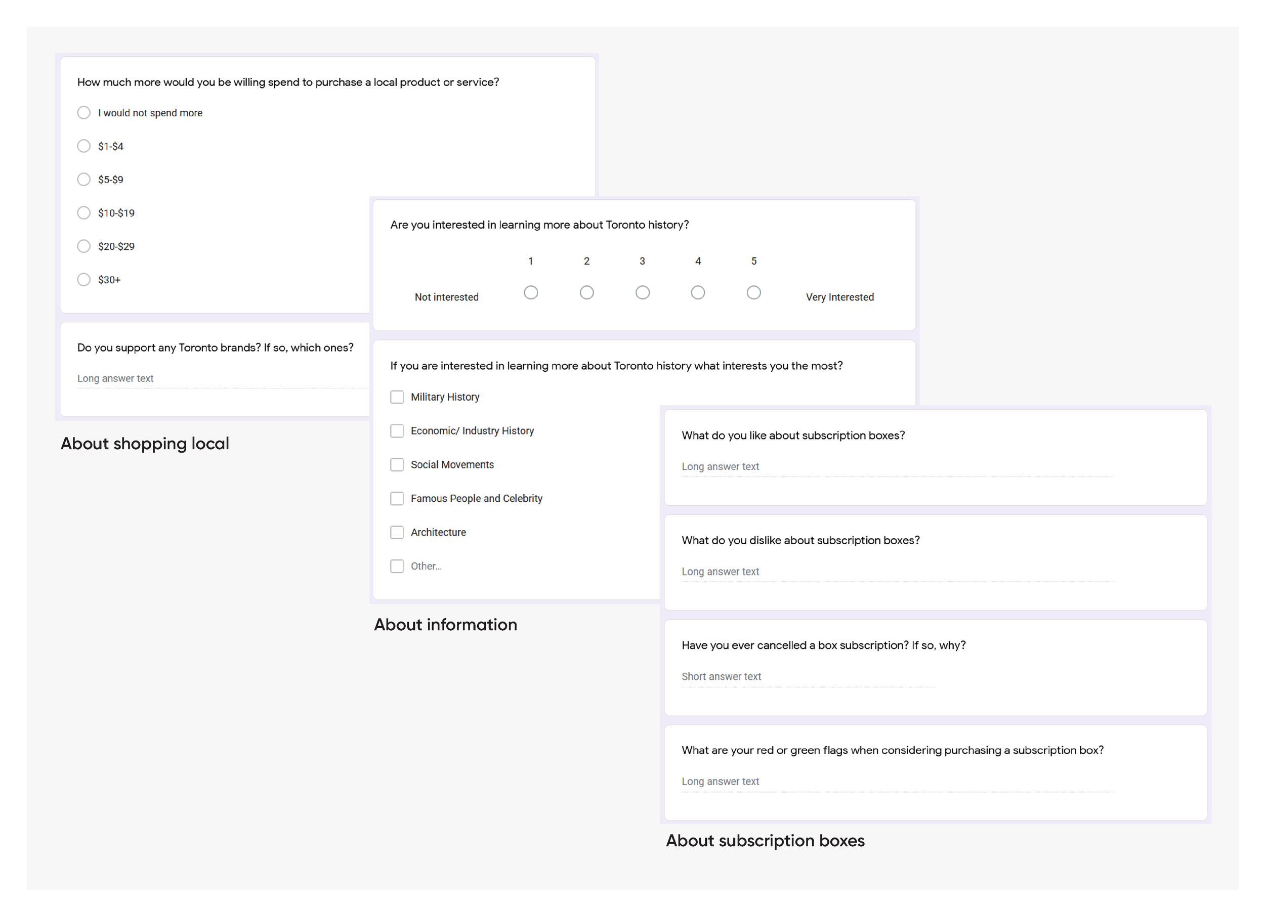
To ensure our product was something customers were interested in, we selected a group of users to fill in a survey form about their local shopping habits. The questions covered a range of topics regarding their demographics, shopping trends, subscription boxes, and Toronto interests.
Neighbourhoods
To gain a better understanding of Toronto Neighbourhoods, we spoke with residents to get their perspective on what they love about their environment and the city. We visited specific areas and photographed interesting sites.
We also did secondary research and uncovered old photographs of respective neighbourhoods. Digging up the history of specific regions and stories that helped shape our city was enlightening and made for great content for our box.
Local Products
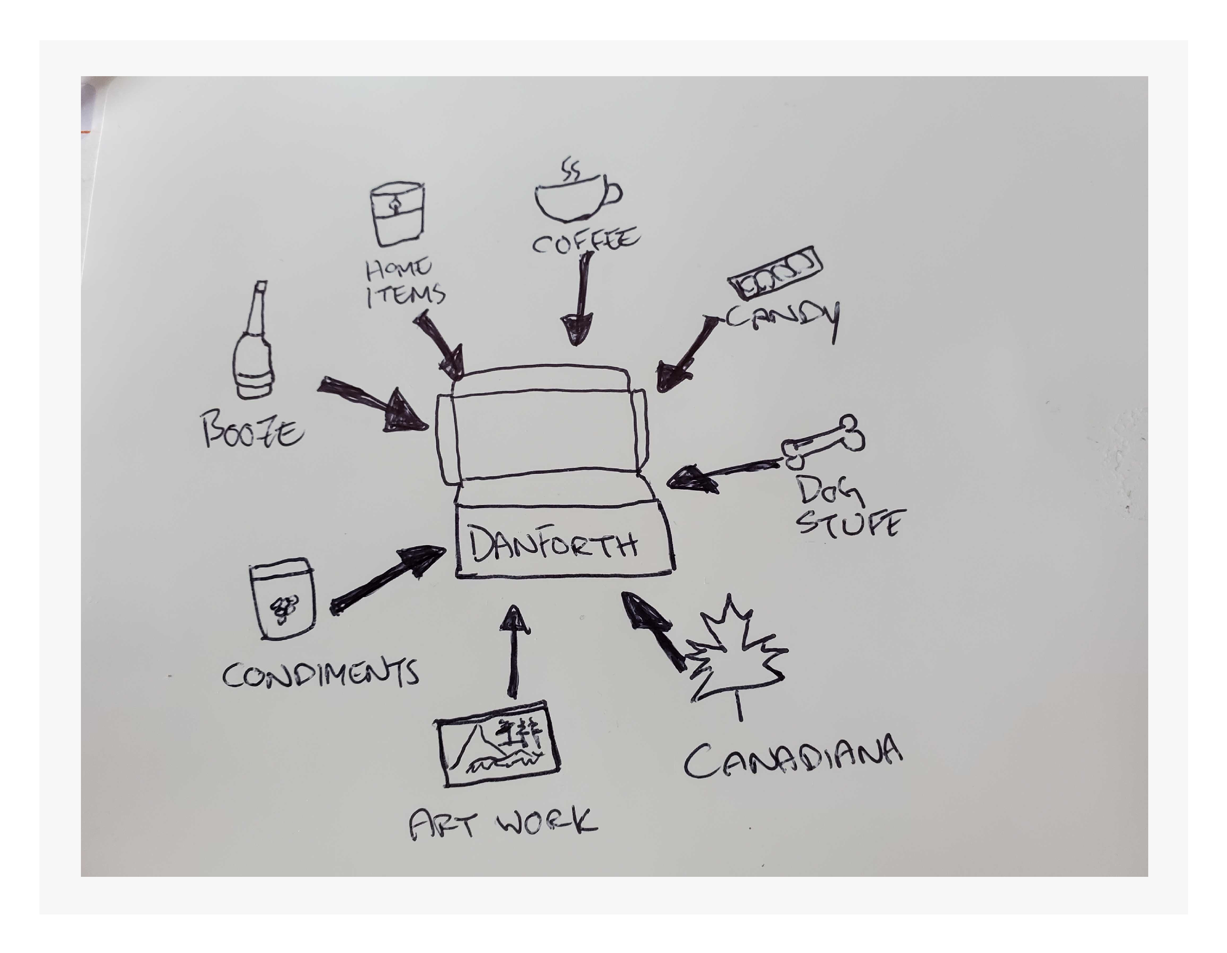
This was an opportunity to taste test and QA products that we found interesting and were moderately priced. We put together a grading system to identify what products were representative of the neighbourhood we were visiting and how they fit into the box. The challenge here was to find products that weren’t repetitive in other boxes, had a unique quality, fit our tight budget, didn’t require temperature control or come with a short shelf life and maintained a balance of kept items to consumables. This was a monthly task that would get more challenging as time went on.
At this point we had collected enough data to understand the stakeholders and the customers. We knew the lockdown situation and had explored the city enough to know what the community loved about the city.
Persona
By combing through qualitative data, organizing key themes and drawing patterns between participants, we were able to develop an insightful persona for our target market.
Core Concept
It’s important to ensure every bit of the concept is supported by our research and findings.
The X Factor
Unboxing experience - Building the unboxing experience is critical
Exclusives - Create content that customers cannot get anywhere else
Products - Ensure products match quality expectations
Information - Be the expert; customers should want to learn from you
At this stage we had a clear understanding of the target user, stakeholders, and product so we proceeded to break down the components needed to execute the project.
The brand to draw target customers
The website for users to learn, view and purchase
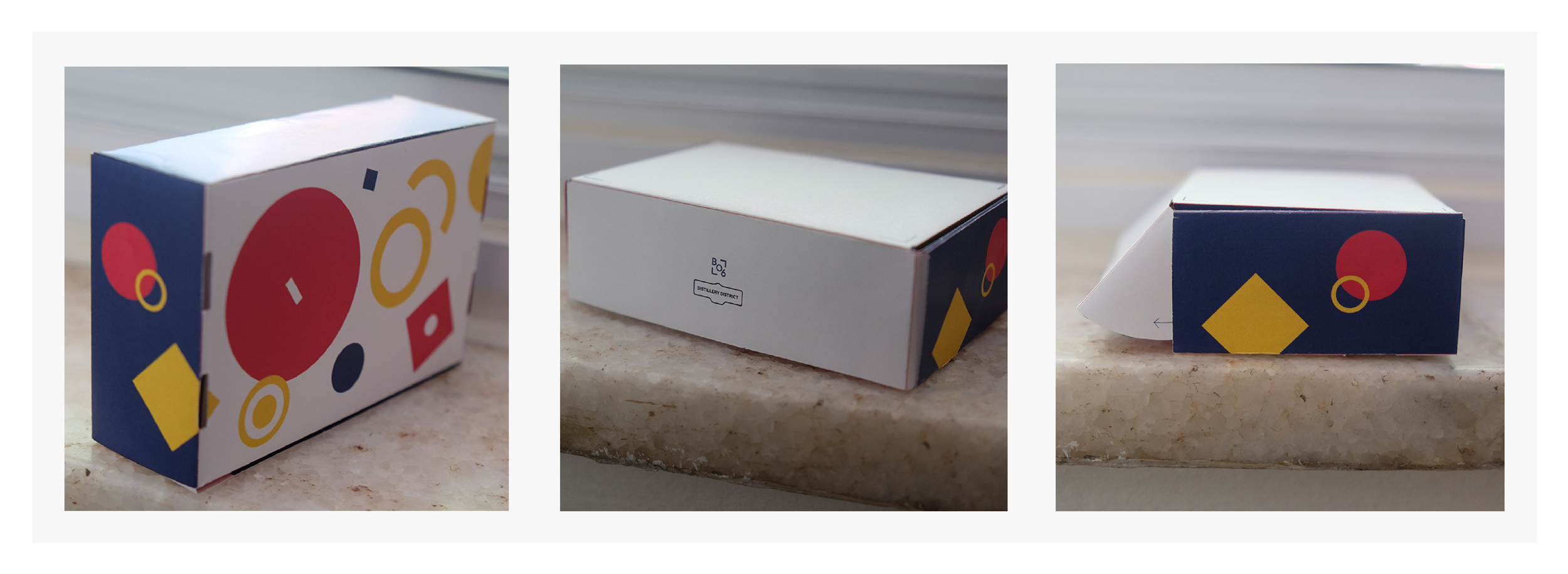
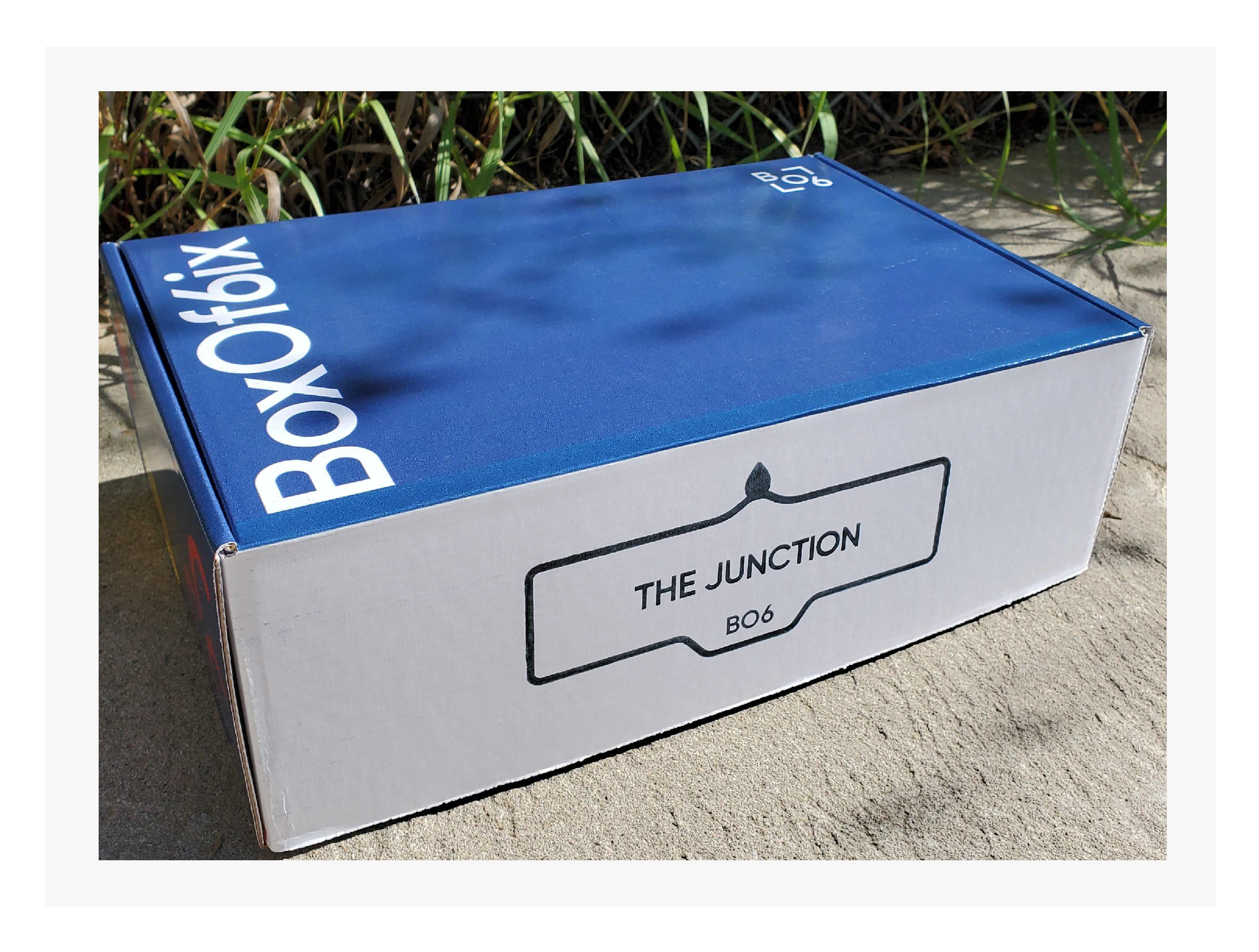
The box customers will receive
The information booklet customers will receive
Branding
The Competitive Analysis showed that when it comes to subscription boxes, the most successful brands had a clear identity with structured branding.
Playing with a number of colour palettes that spoke to Torontonians for many different reasons.
Our logo was important to draw the eye of customers and communicate who we are in a concise way. We continued discussing themes and playing with shapes and finally narrowed down a “stamped” visual look. We chose this as boxes often have inked stamp marks on them. Our target market is from a time when traditional mail was the primary means for receiving items so choosing a stamped look could spark nostalgia.
We looked at different typography believing that stylized and bold was the way to go.
Website
When designing the website UI, it was important to refer to the research and findings to inform the system and layout decisions.
Our user persona indicates that the user would not want to spend an ample amount of time on the website. They want to be presented with facts quickly to understand the concept and when making the decision to purchase - a speedy checkout process. The standard subscription box user flow already accommodates these needs. We chose to add extra sections more relative to our niche; supporting local and building a community of people who want to share the local products they love.
Box
As we learned from our research, the most successful boxes have a variety of products that can be consumed, kept for a limited time, kept for a long time and informational content. When deciding what goes into the box, we take all of this into account and design a structure to accomplish this.
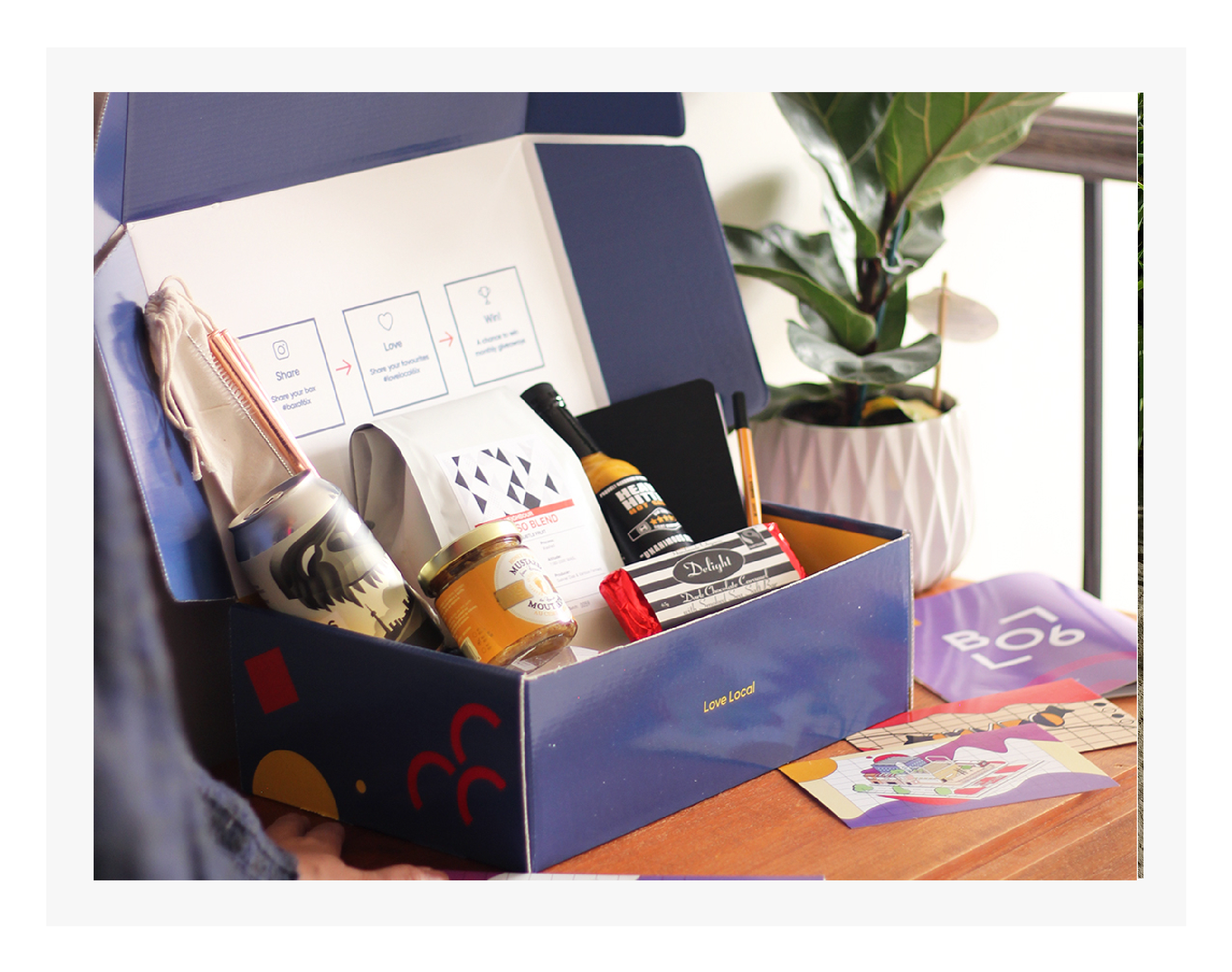
Our box is all about supporting local, feeling good about being a part of the community and enjoying what Toronto has to offer. Community is the key word here and we needed to build a community of our own local lovers. To accomplish this we utilized the box to encourage people to share their purchase on social media. This ultimately encourages other like minded people to engage with our brand as well.
We also wanted this to be a fun, enjoyable experience that people can feel excited to receive or gift to others. Our direction aimed to be tastefully colourful and feel like a celebration.
Booklet
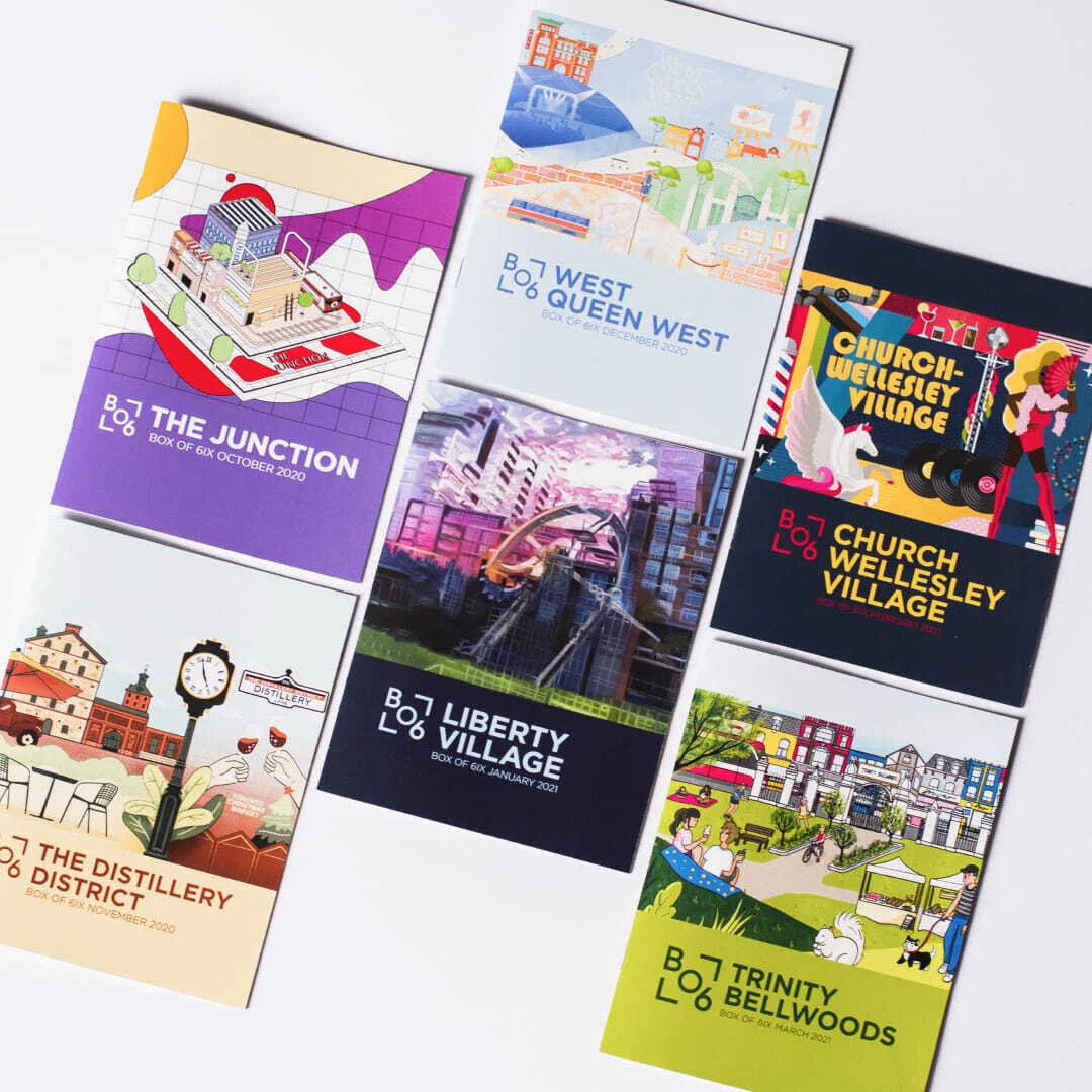
The booklet is where we showcase the desired information about the neighbourhood, local businesses and their products, recommendations, illustrator commissions, bio and their contact info, local musician QR, bio and their contact info, and any coupons or discounts provided by those featured.
The Brand
Returning to the research for guidance, our final font was chosen because it was clear, legible and ultimately conveyed a serious yet inviting tone which matched our target user perfectly. We went with bold primary colours and chose a blue that was reminiscent of beloved Toronto sports teams. The yellow and red were chosen as punchy accents to compliment the blue. Our logo was designed to tile well, be bold on it’s own and be stamped on to promotional materials when needed.
The Website
While a great deal of time and consideration went into designing an exceptional experience for the website, in the end we had to consider other factors that came to light. To run the business well and make informed decisions about marketing strategies and further product development, we needed to have specific analytics enabled.
The subscription box model has a few key platforms that focus on the type of analytics we were interested in incorporating that included customer support for our backend. We could have coded the backend on our own, however that would have required more time and money that we didn’t have if we wanted to help businesses before the pandemic caused even more damage.
Given the parameters and resources available, we made the choice to work with Cratejoy and their templates where we could change some CSS, but overall the user flow was locked into their template designs. As an Experience Designer, it was a tough decision to make but the compromise meant that we could help people and that was the overall intention.
The Unboxing Experience
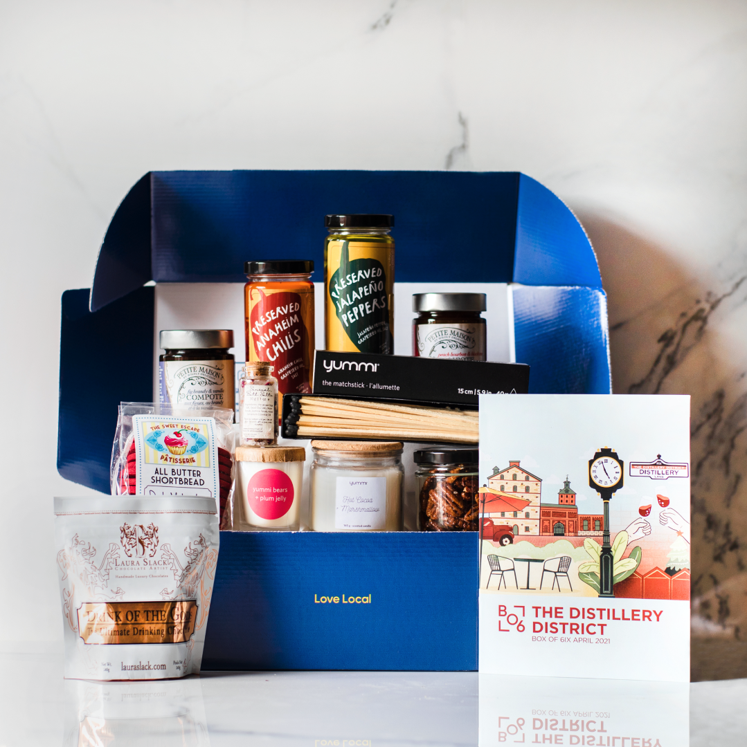
Our box experience begins with the fun, bold colours along the outside and a stamp of the featured neighbourhood on the front flap to tease the recipient.
As the recipient opens the box, the first thing they see is a booklet with a beautiful illustration of the featured neighbourhood on top of our branded tissue paper. Looking up they can see the prompt to share their experience on social media with an incentive.
Pulling back the tissue paper reveals the goodies of the featured neighbourhood.
The Booklet
The booklets stayed true to our original design and wireframes as presented. We added a map that corresponded to the businesses featured in the neighbourhood to help guide customers to the shops they could explore more in depth.
Key Insights and Takeaways
Our information booklet became the highlight of the project. Each month featured a completely different neighbourhood but used the same layout. It truly helped our customers feel connected to the city and it’s local businesses. Month after month, we received compliments about how amazing the booklet was and to keep them coming. Academic advisors and mentors encouraged me to publish the booklets beyond Box Of 6ix and take it to a larger tourism outlet.
The key to making this a success was consistency. It was important for us to ensure every month was a great experience and we accomplished that by designing a system that worked from month to month. Each month was the same yet different.
Given the context, timing and social impact of the business, we showed continued growth from launch until vaccine rollout was announced in May 2021. At our peak, we maintained almost 400 individual subscribers. Many local blogs and news outlets featured us and spearheaded our success among customers across Canada.
With vaccines rolling out at a higher pace in Toronto, Ontario and Canada, it was important for us to look at our customers and our data and understand what that meant for our business. As our height of success stemmed from lockdowns, we saw less traffic to our website, a drop in subscriber acquisition and a higher rate of cancellations. This became the time to pivot.
Looking back at our data from over the holidays, we found a great number of custom orders driven by corporate businesses. These businesses were interested in a few things.
Rewarding their employees for specific work
Building relationships within the company
Thanking their employees for a job well done during the pandemic crisis
Maintaining/establishing their management reputation
More information coming soon about our pivot.


